Behind the Logo of Audi


As we find ourselves in the second week of the 2024 Summer Olympics, I wanted to kick off our Behind the Logo series with a brand that is also well-known for its iconic rings: Audi. Out of all the car brands, the Audi logo is my favorite. As a designer, I appreciate its simplicity, structure, and balance. It was the first car brand logo that left a lasting impression on me when I was growing up in the 80s. I distinctly remember recognizing those four rings above all other car brands and anticipating the sight of an Audi coming down the street.


Nearly four decades later, those four rings still mark the front and back of the German automobile. In fact, today's Audi logo is essentially the same as it was when the brand was just getting started in the 1930s. Well, actually, Audi is much older than that since, technically, the company was founded in 1909, but the origin story of the four-ring iconic logo we all know coincides with the start of a new company, founded in 1932 after the merger of four brands.

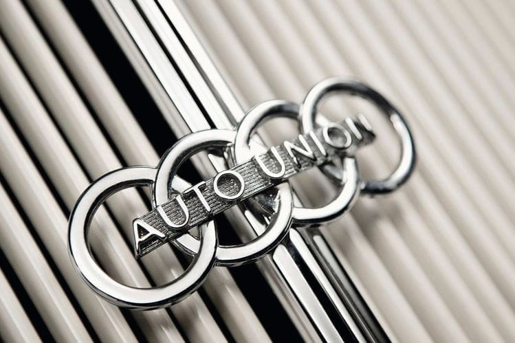
In an effort to combine their resources and expertise, Audi (founded in 1909), DKW (founded in 1916), Horch (founded in 1899), and Wanderer (founded in 1896) united to form Auto Union. The interlocking four rings symbolize the unification of these brands.

Auto Union was rebranded to Audi after the company was acquired by Volkswagen in 1969. VW went on to establish Audi as a premium luxury brand, propelling the brand onto the international stage in the 1980s and laying the foundation for its continued success in the decades that followed.

The first model introduced in the US was the Audi 5000 in 1980. Despite competing with more established brands like BMW and Mercedes, it was a successful launch. In my community, the Audi 5000 made an impact as a status symbol culturally. It even became a slang term widely used in the 1980s and 90s to signify when someone was leaving.
Yes, I used it, I'll admit it.

The Audi logo is a great example of what we aim for when designing logos at 19 The Agency. Our logo design framework requires that a logo must be simple, distinctive, and appropriate The Audi logo fits those characteristics perfectly. In fact, its longevity is one of the reasons why we believe in that framework. For us, the mark of a great logo is that it stands the test of time. The Audi logo has endured for almost 100 years, and I suspect that as long as the brand continues to thrive, it will remain its primary mark.


